About
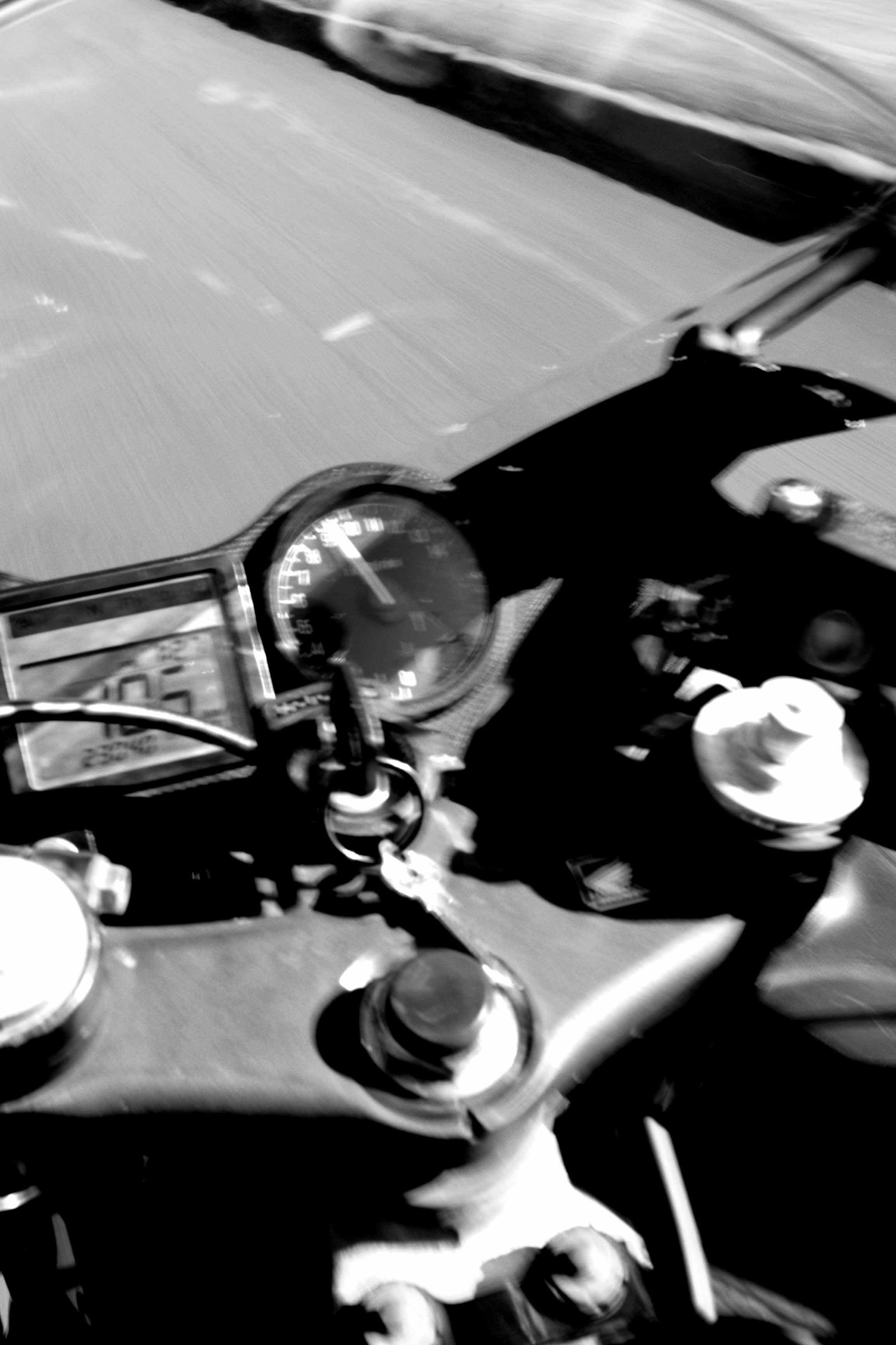
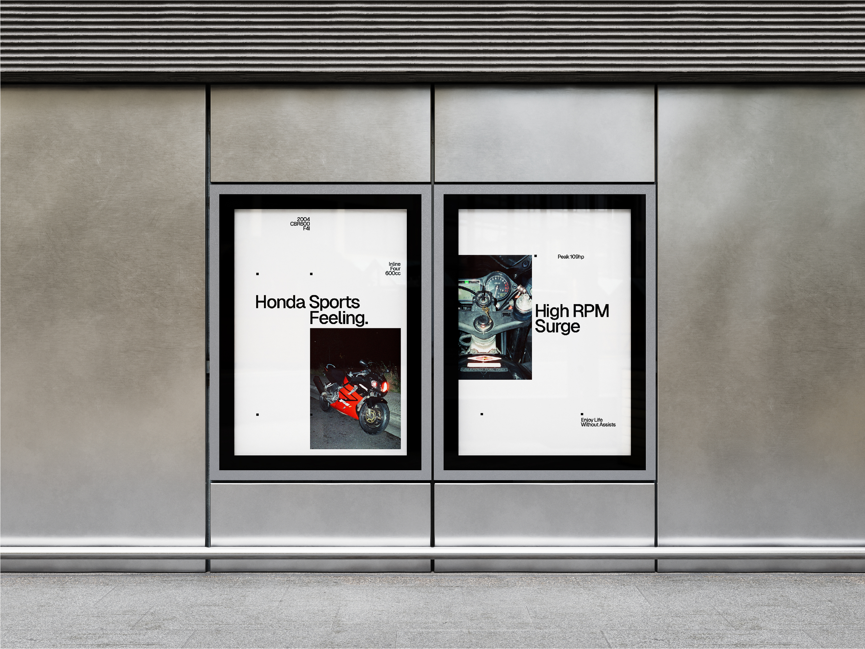
Hi, I’m Luca. I’ve been making things my whole life, and am lucky to call design my job. I’m currently based in Sydney, where I build brand identities by day at Refract, and work on freelance projects and motorcycles by night.
Contact
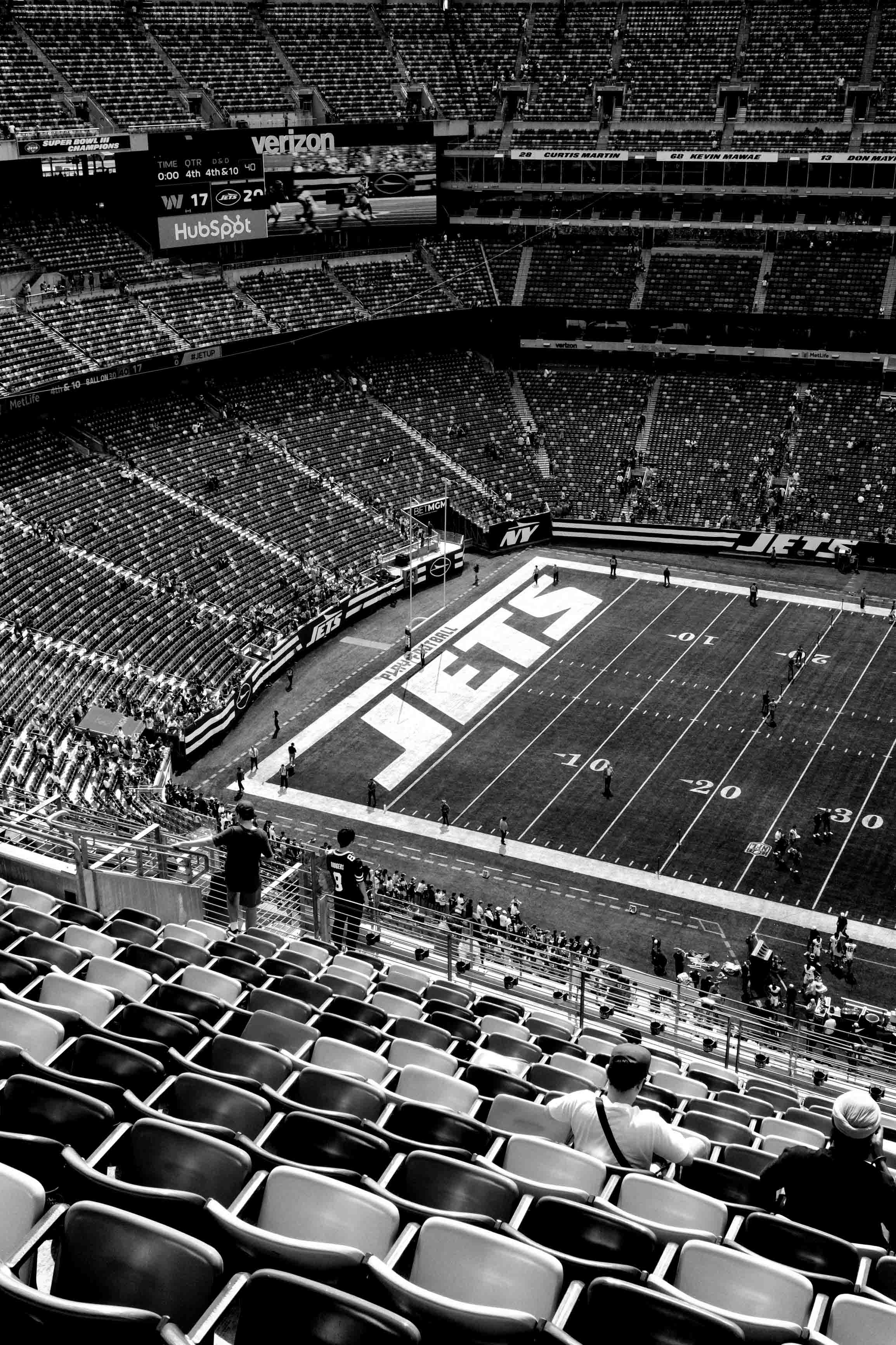
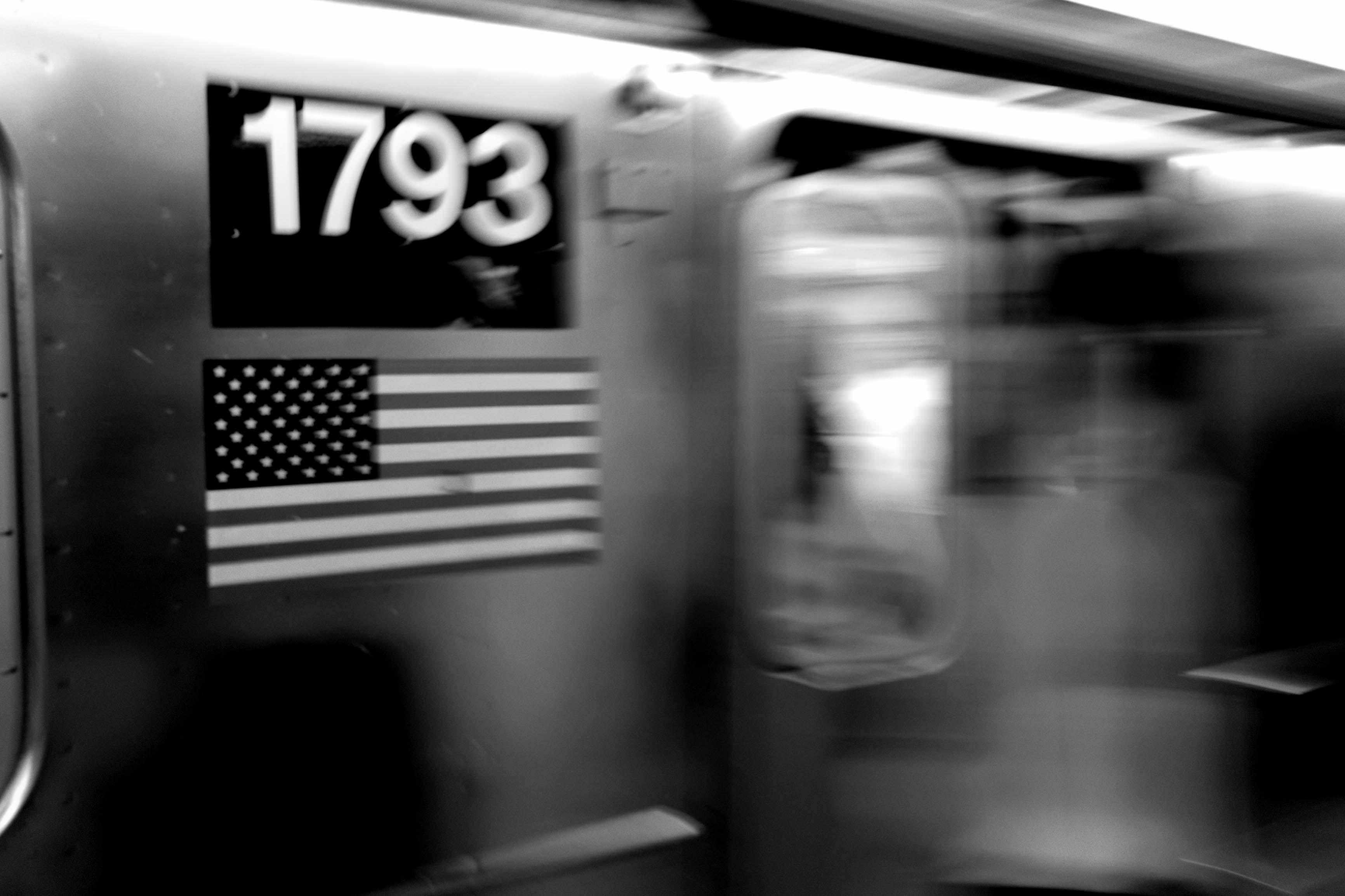
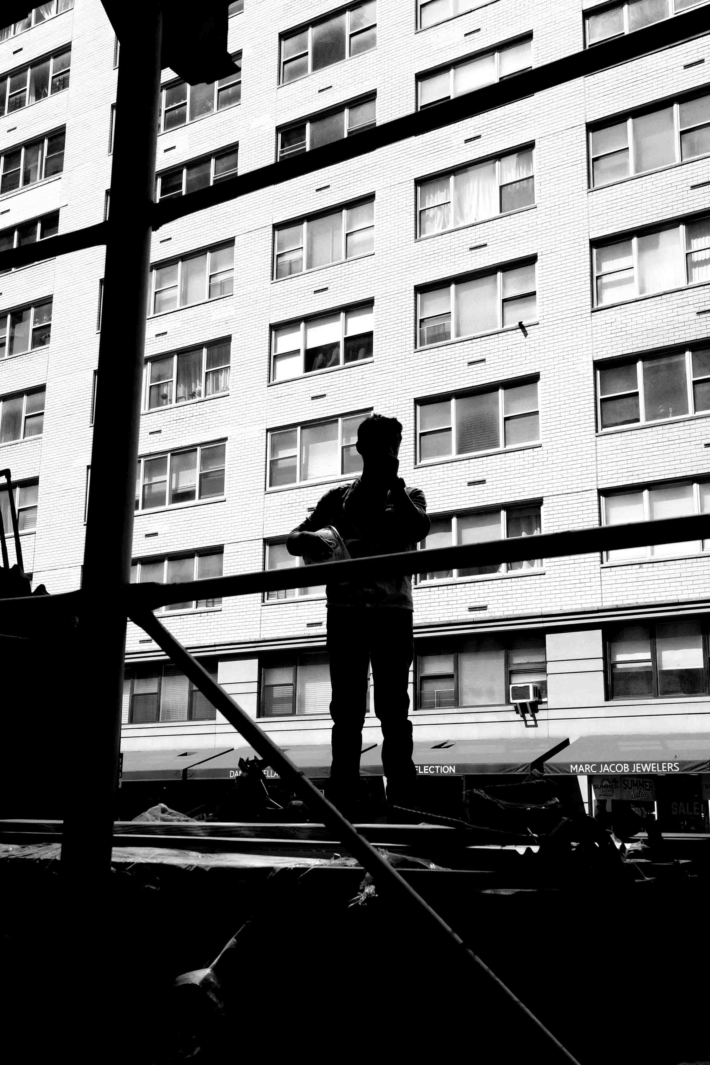
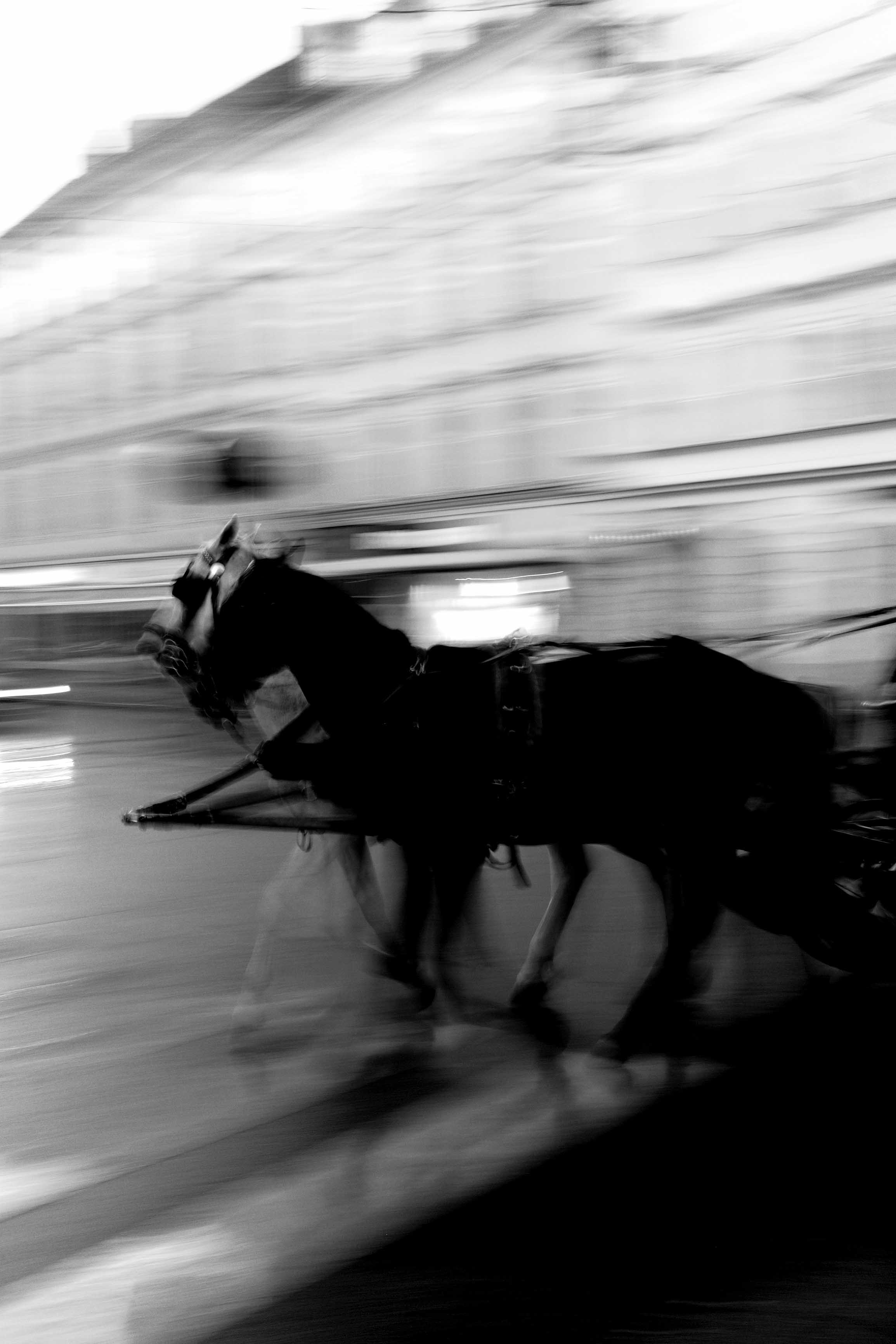
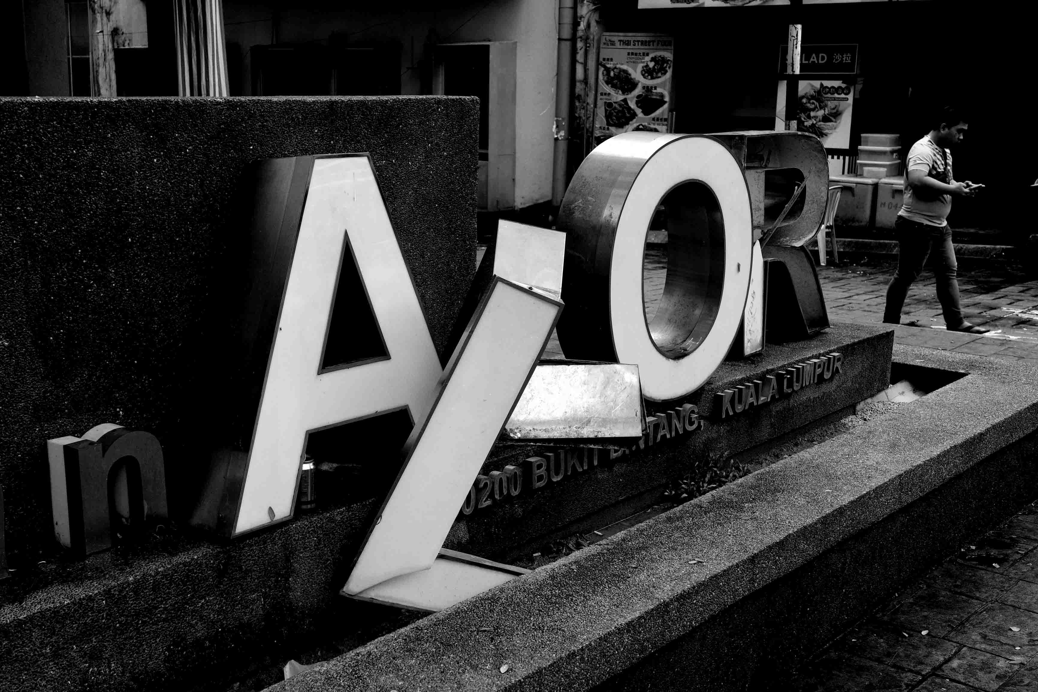
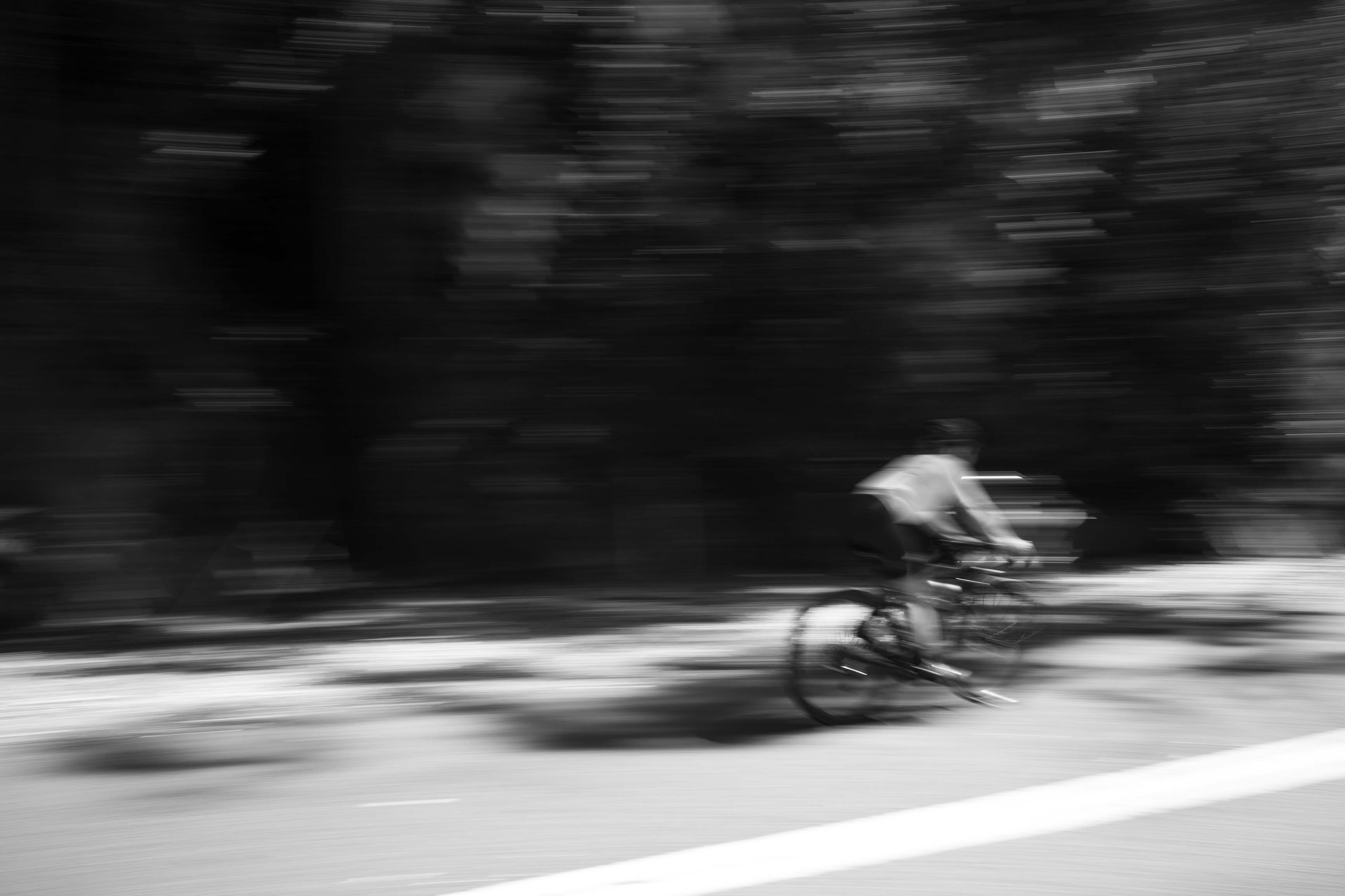
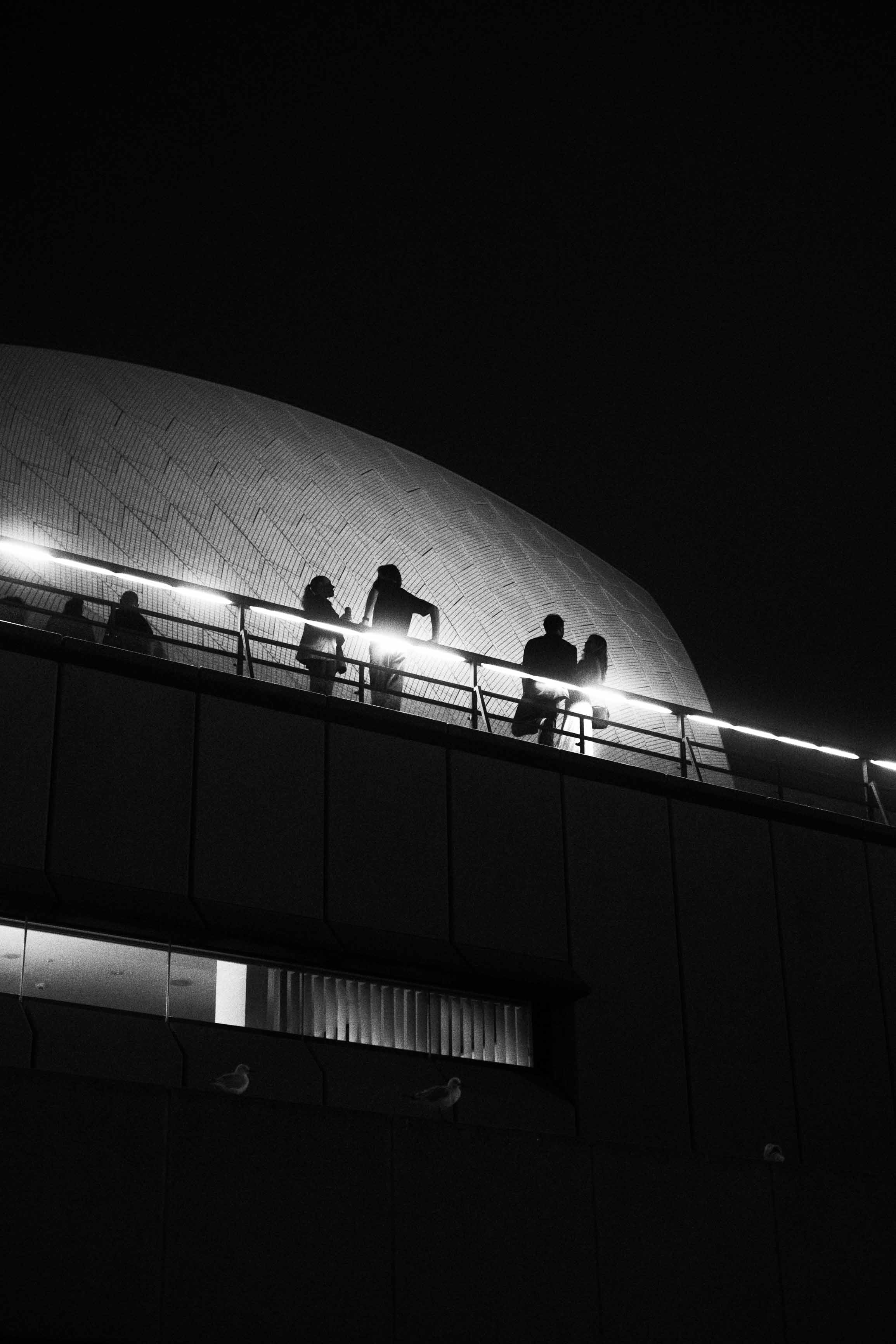
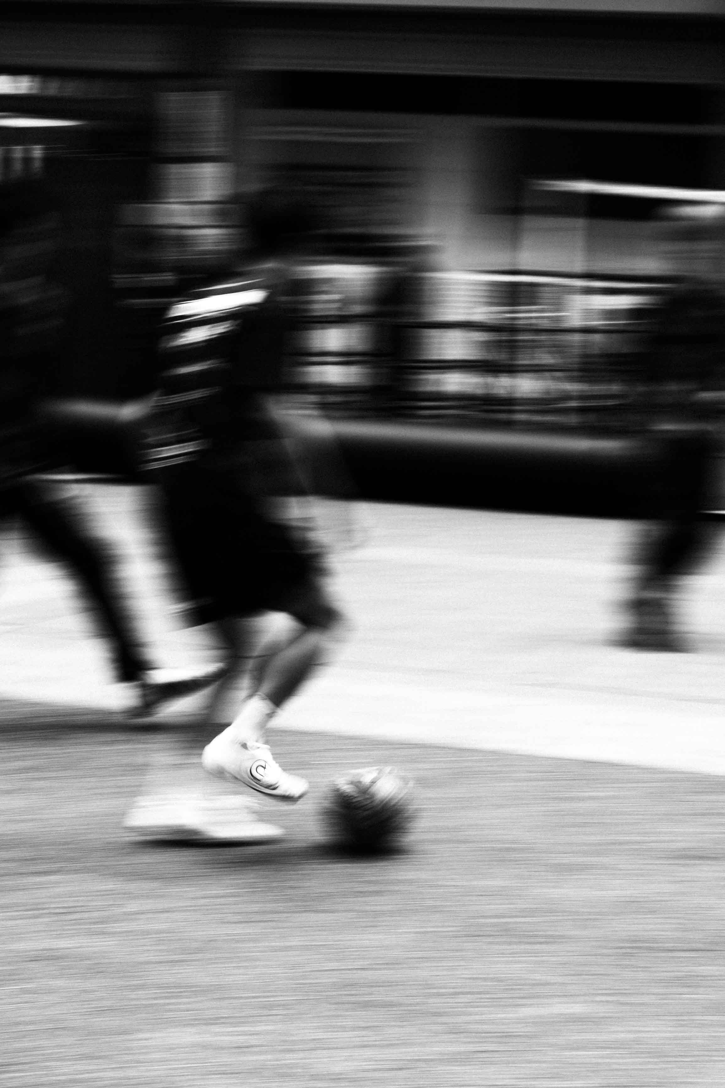
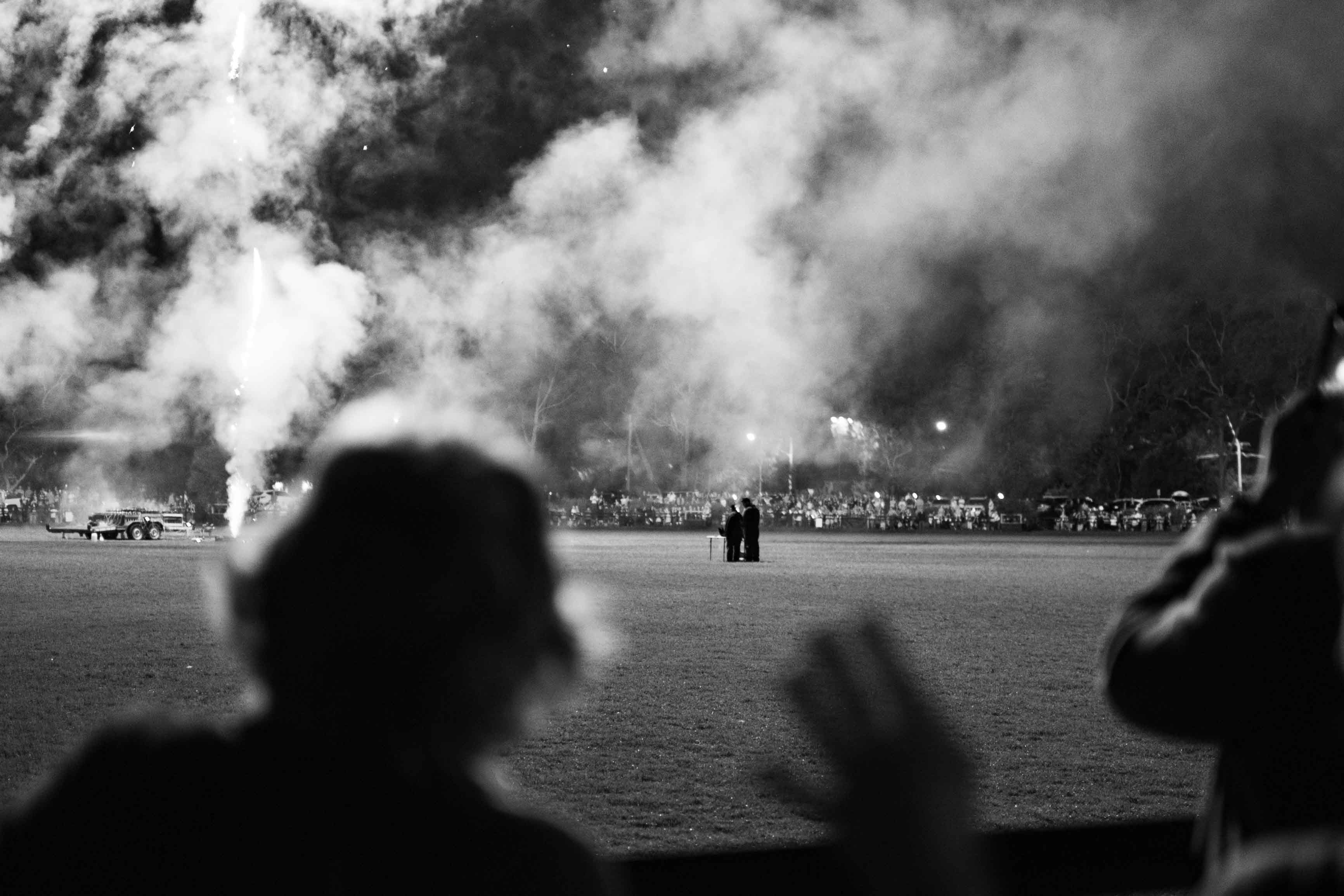
Photography
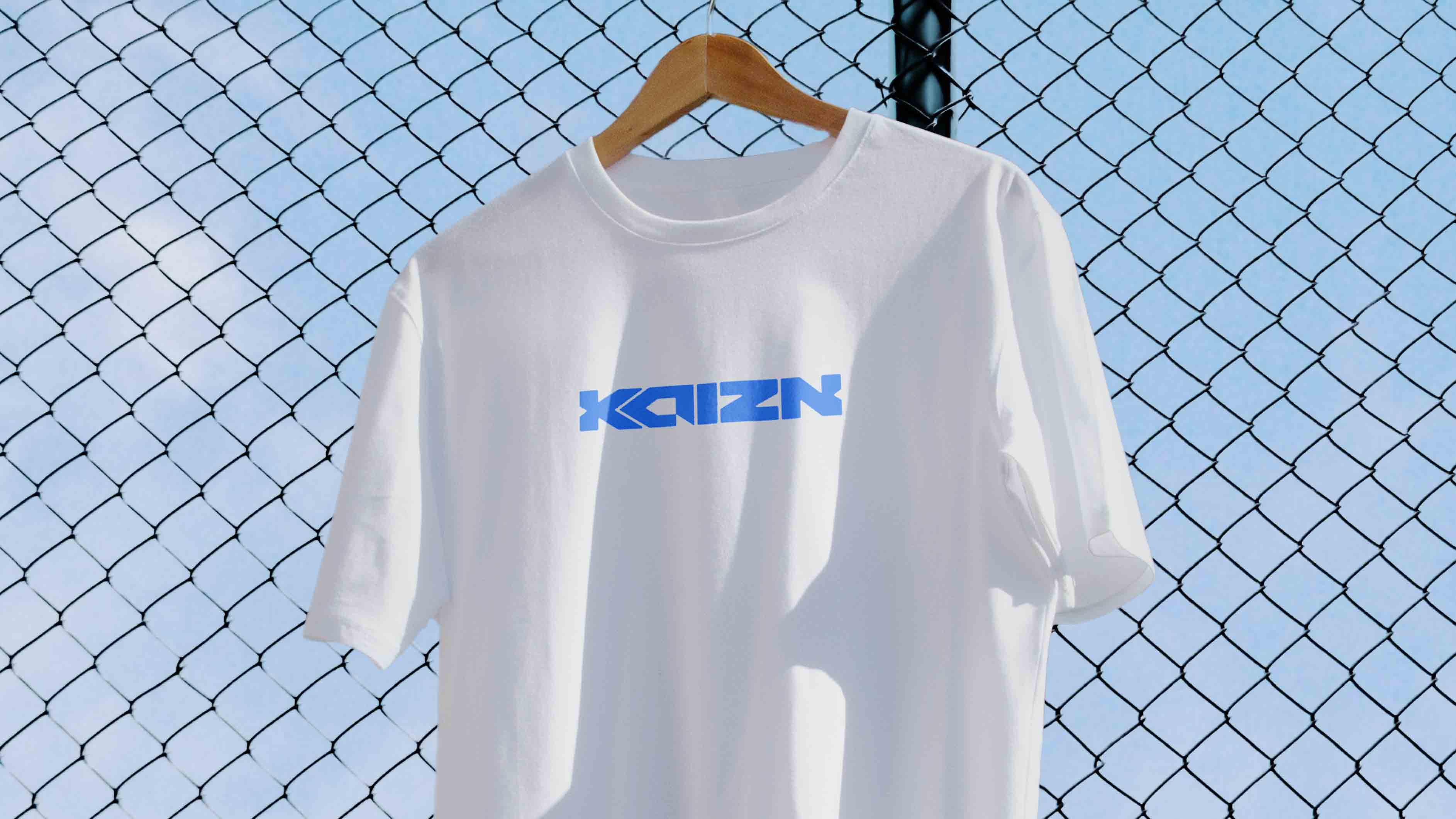
Mockups
Design