T-Lab
Engineering
Student Work
2022
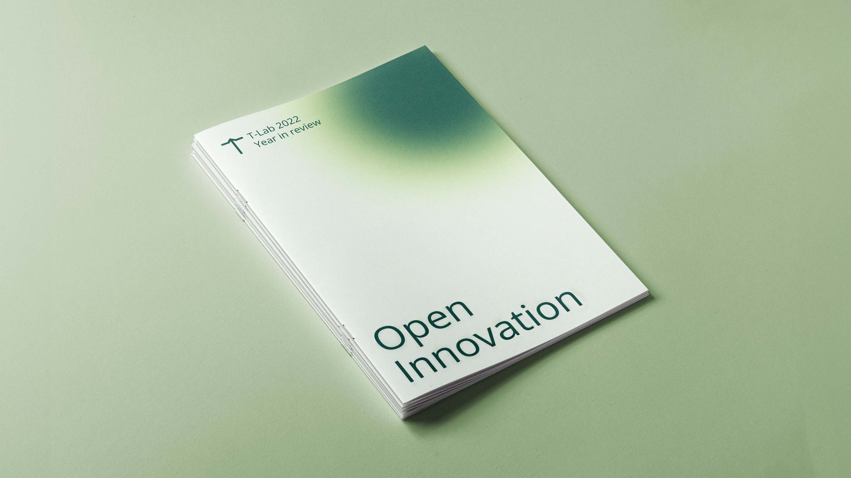
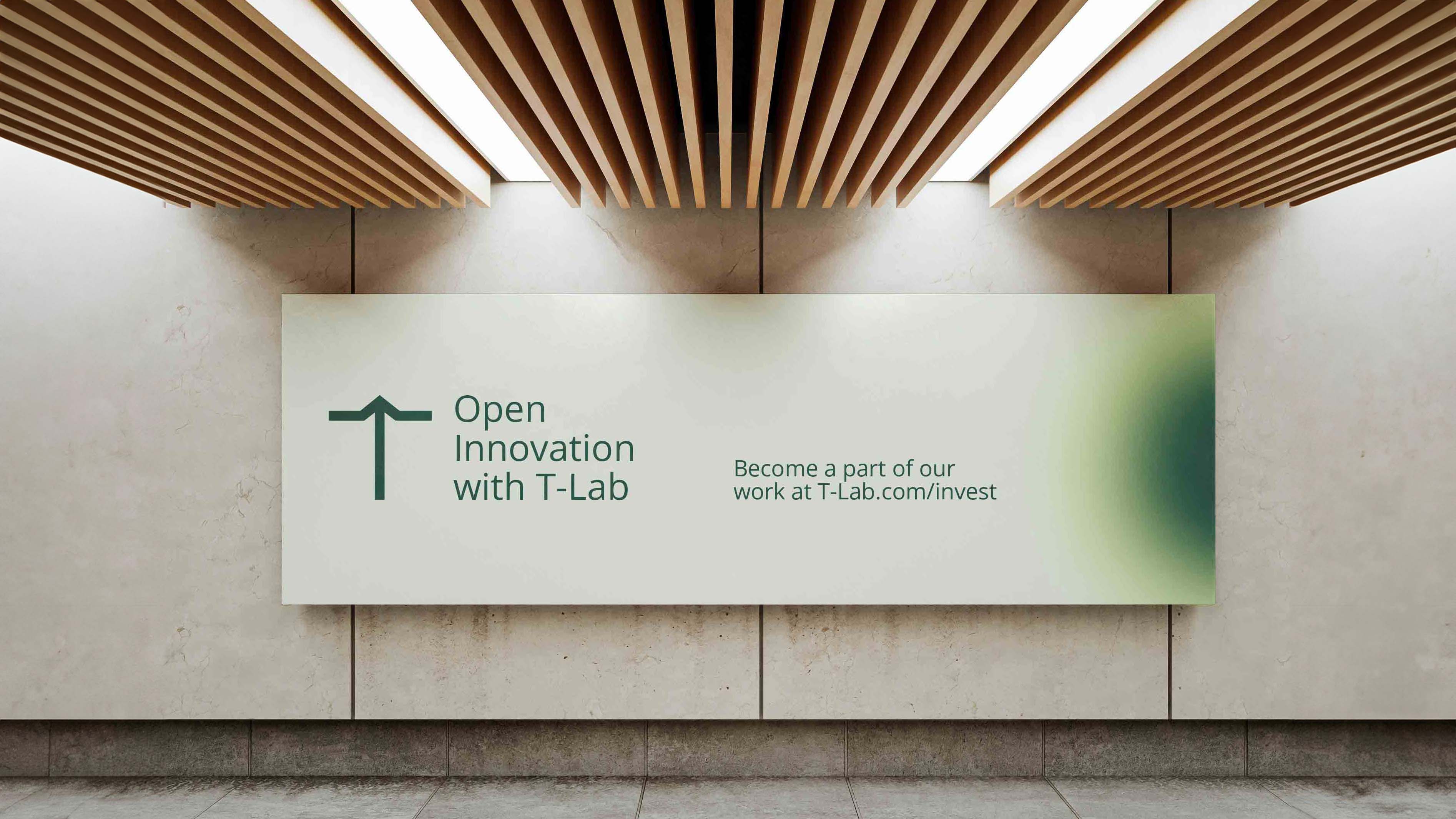
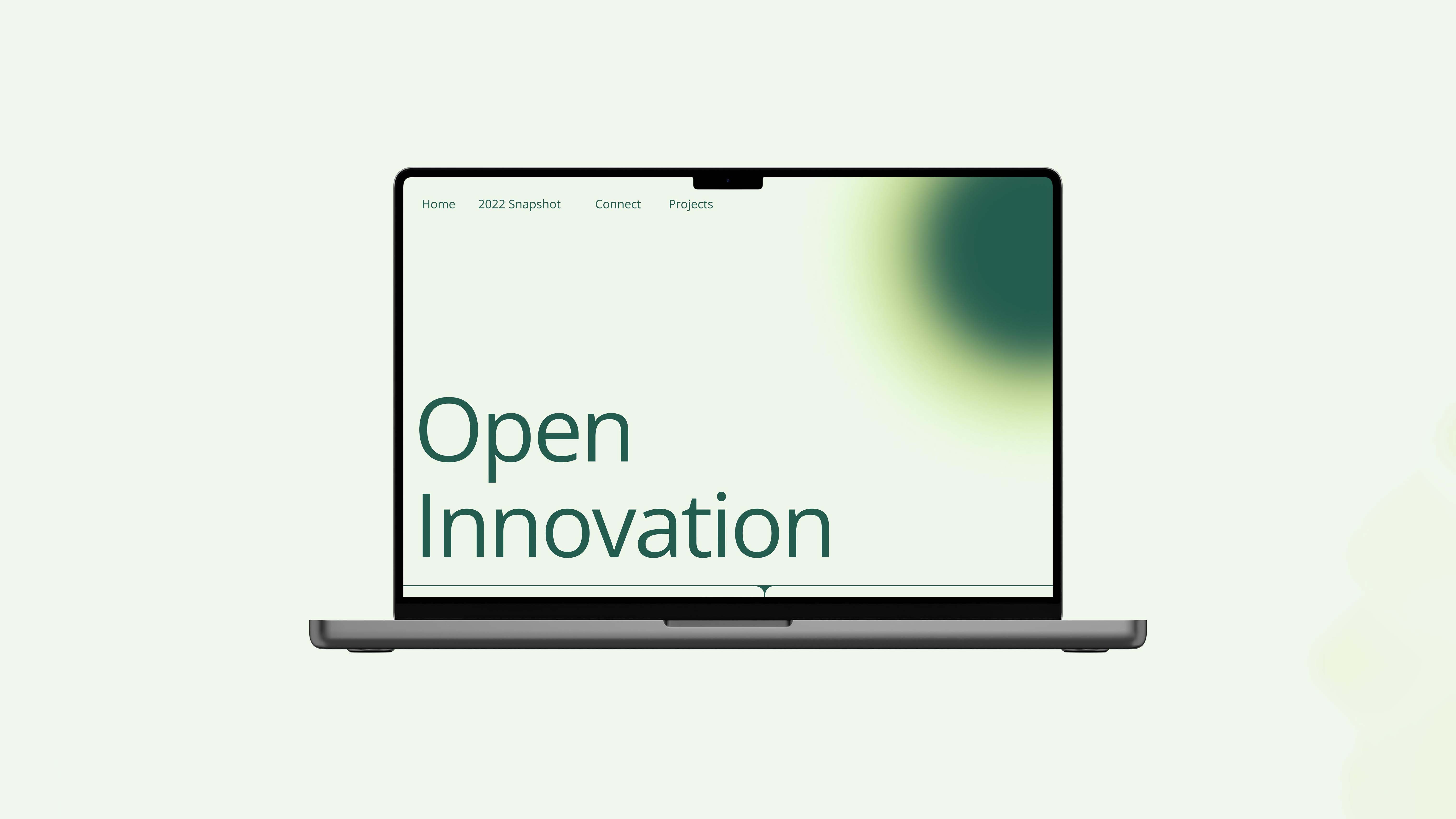
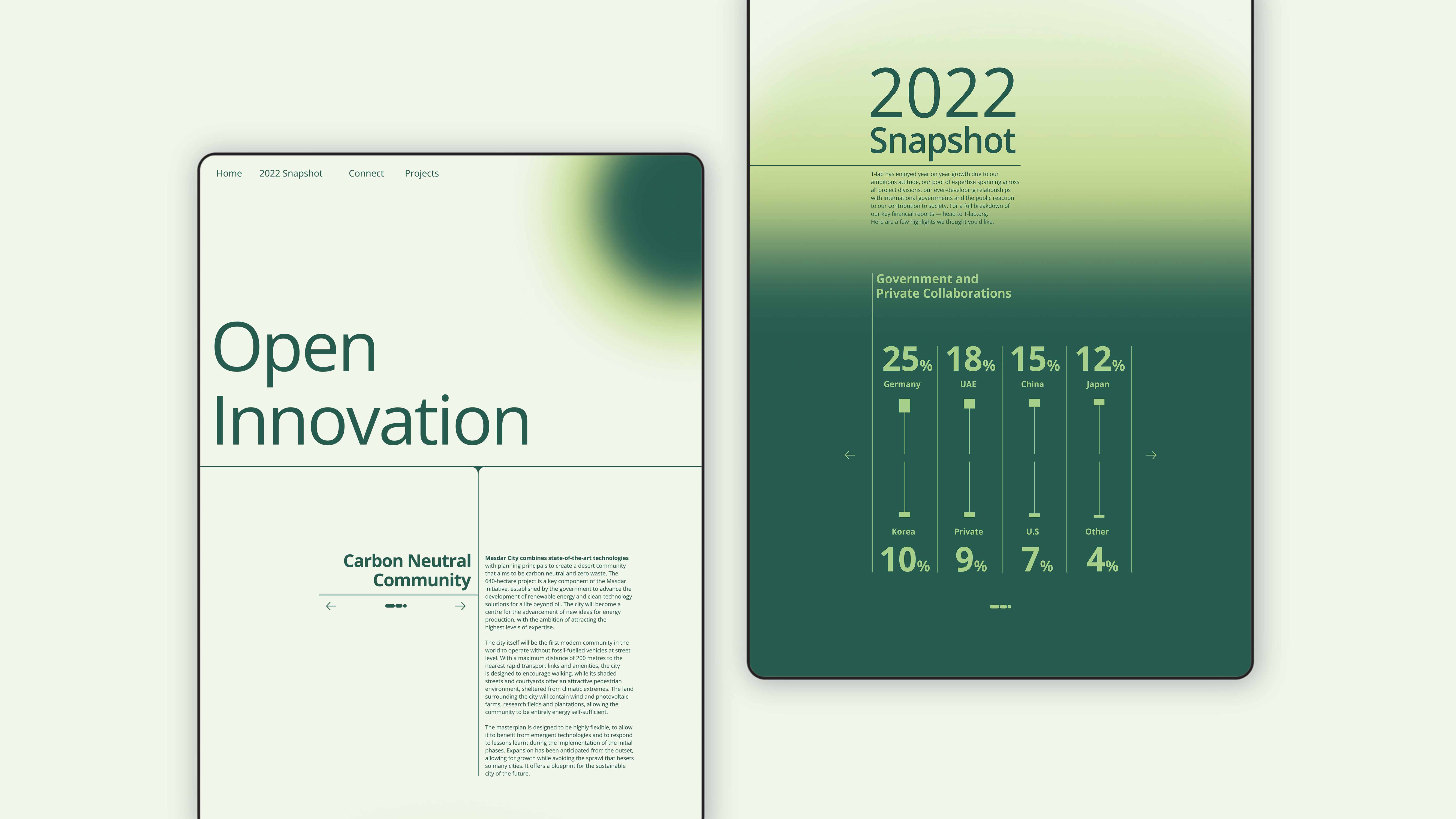
The identity of T-Lab, a technology and innovation company, was shaped around a vision of a brighter
tomorrow. The identity features gradient elements reminiscent of sunshine, symbolising their commitment to
illuminating the future.
Soft greens in the palette aim to evoke a calming, positive sense. The choice of simple,
honest typography conveys transparency and trustworthiness.
T-Lab’s distinctive logomark encapsulates their dedication to pushing boundaries and advancing together into the future.