Prism
Refract
2026
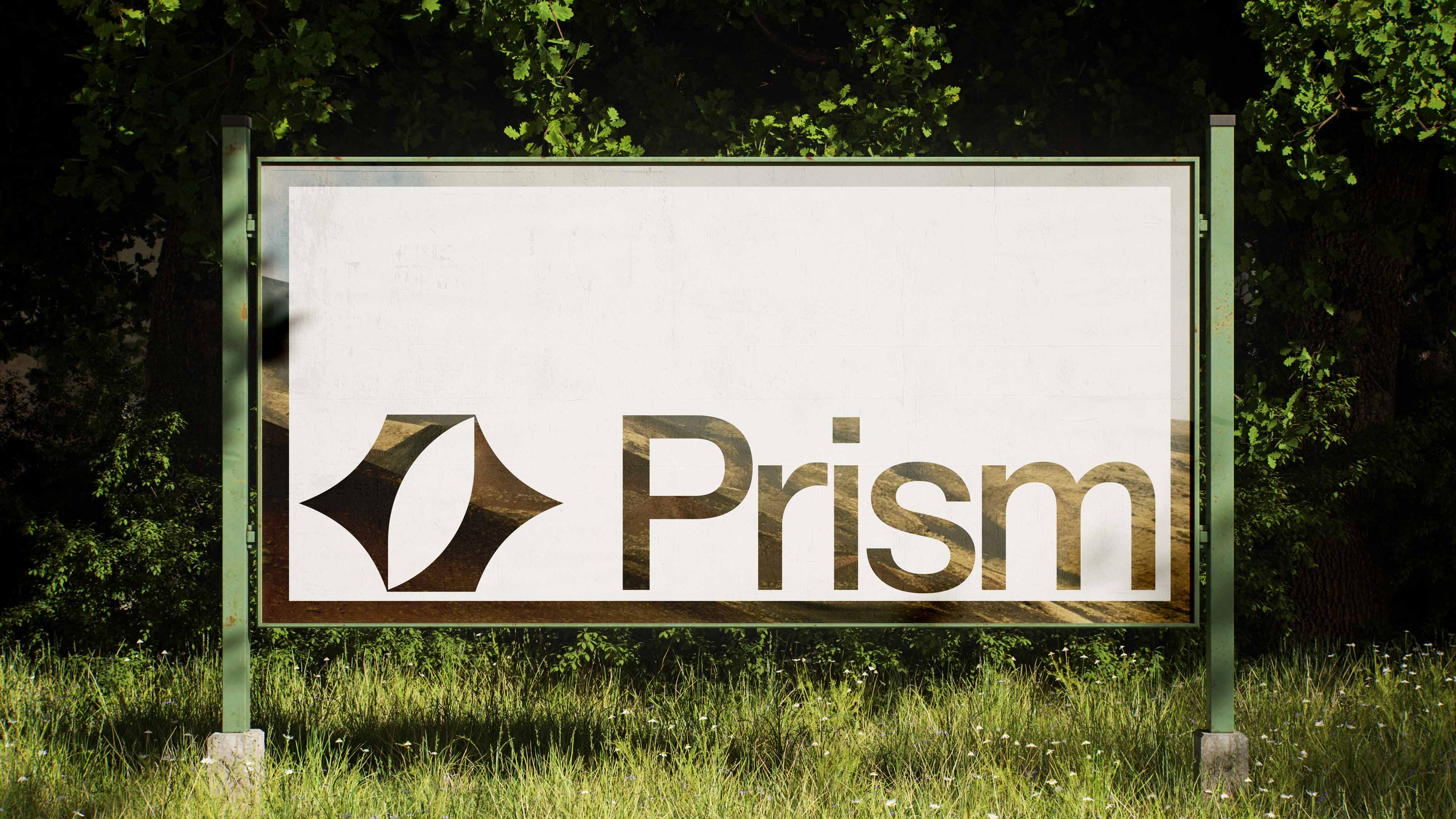
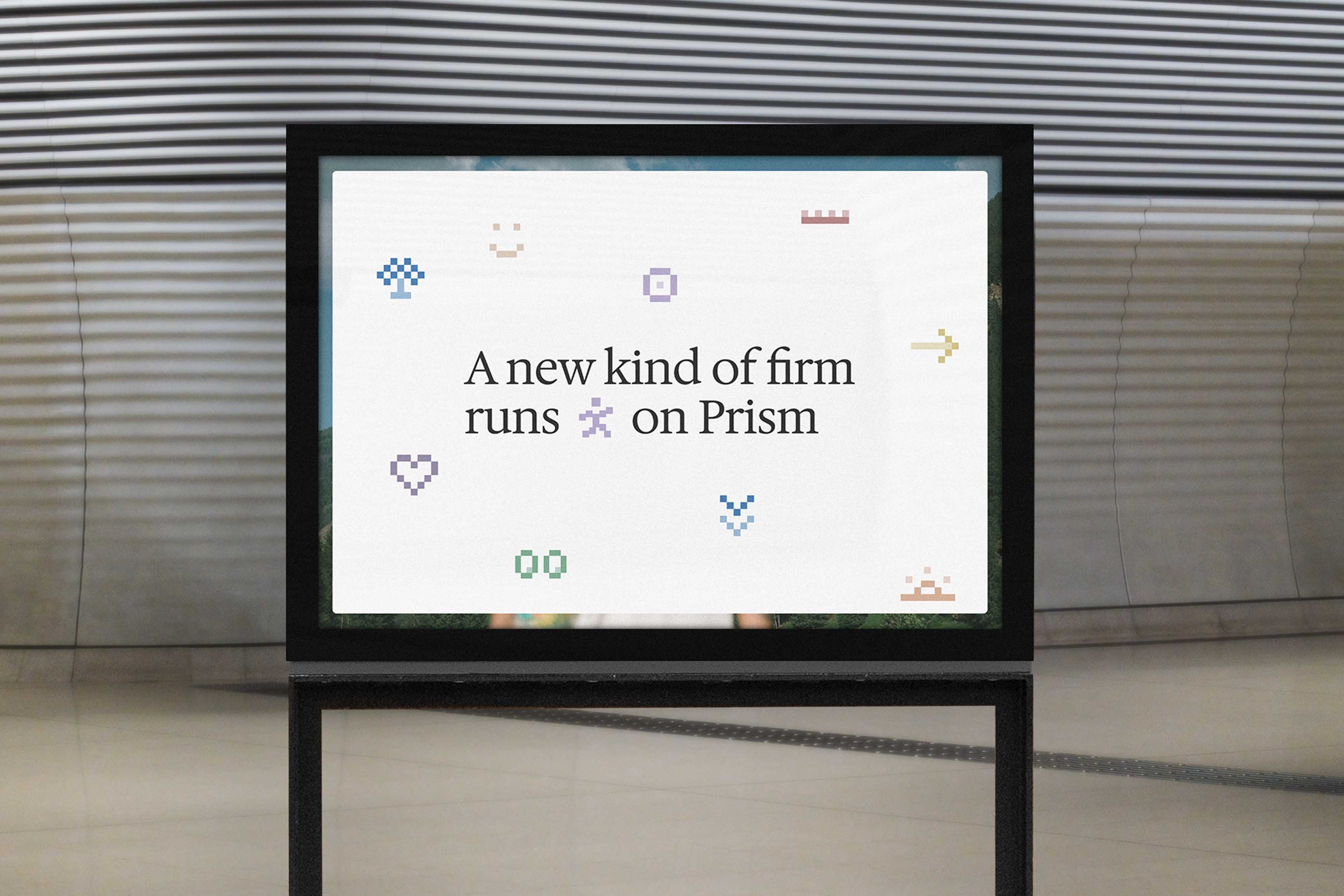
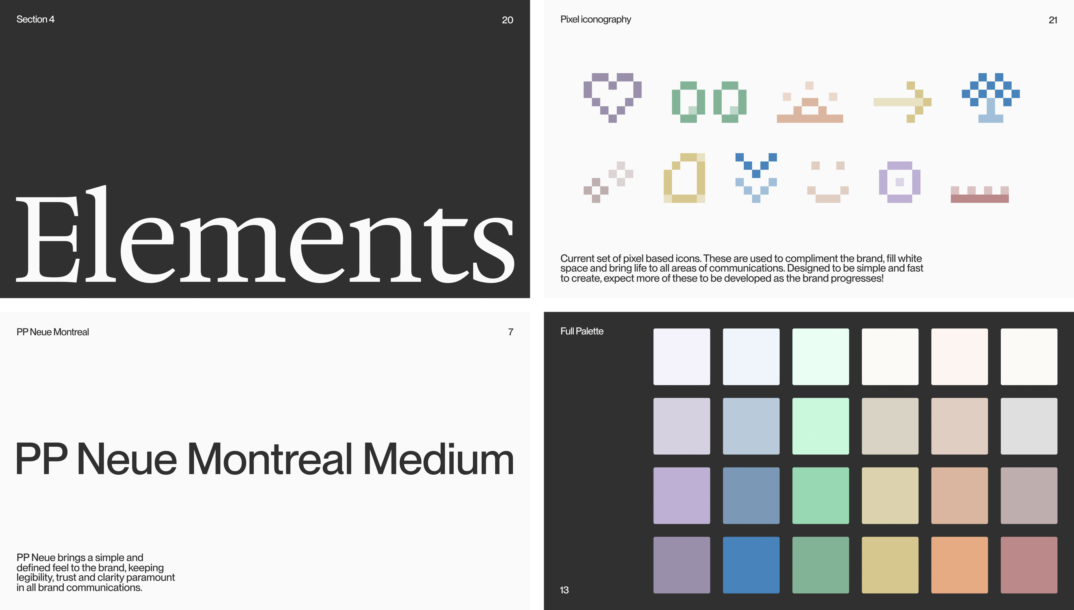
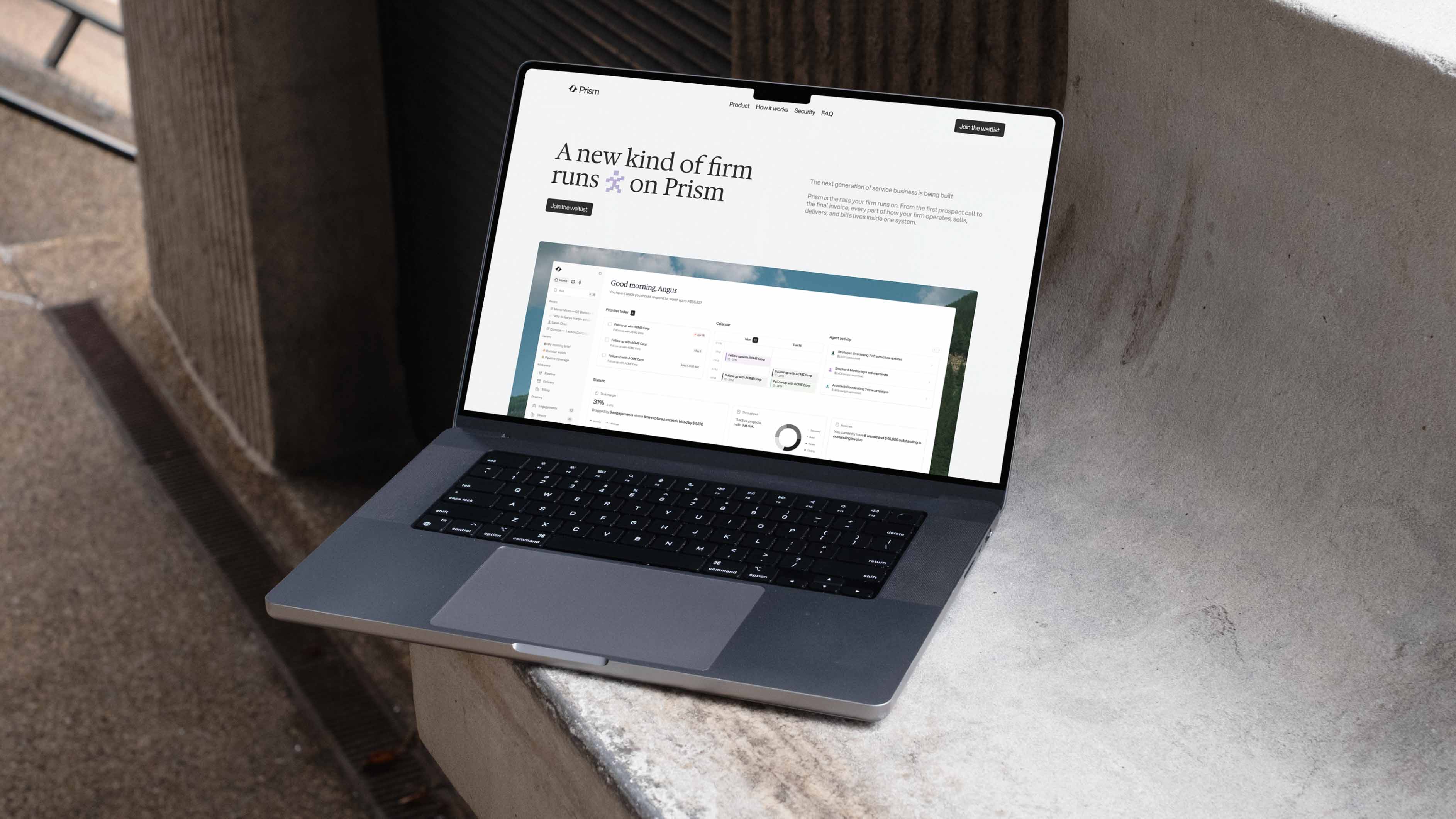
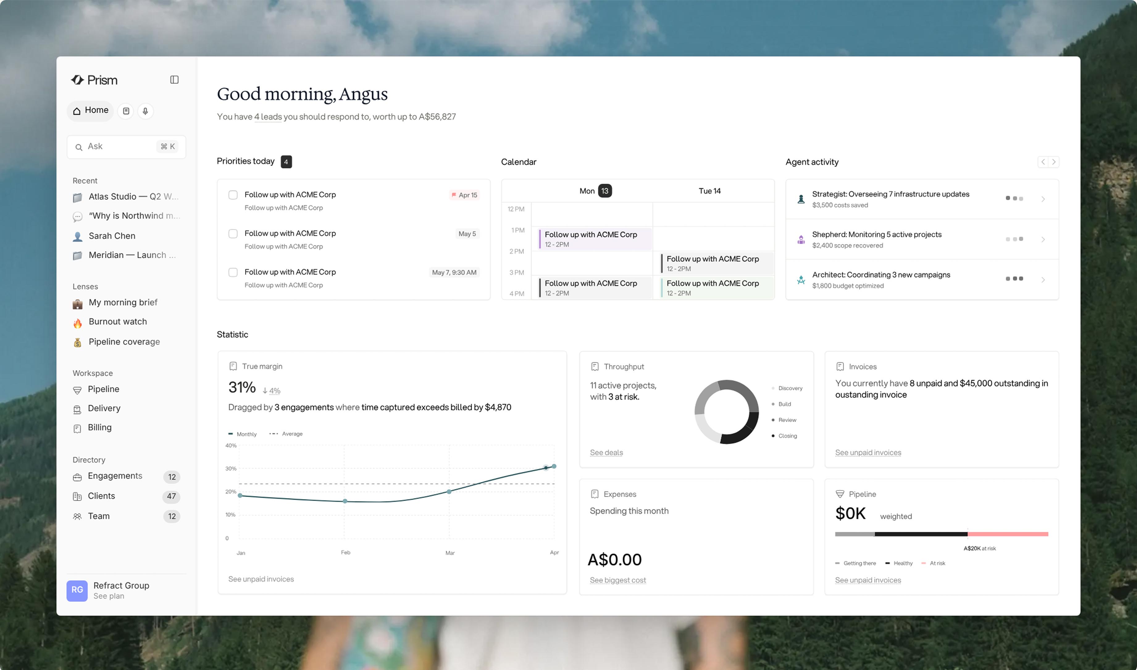
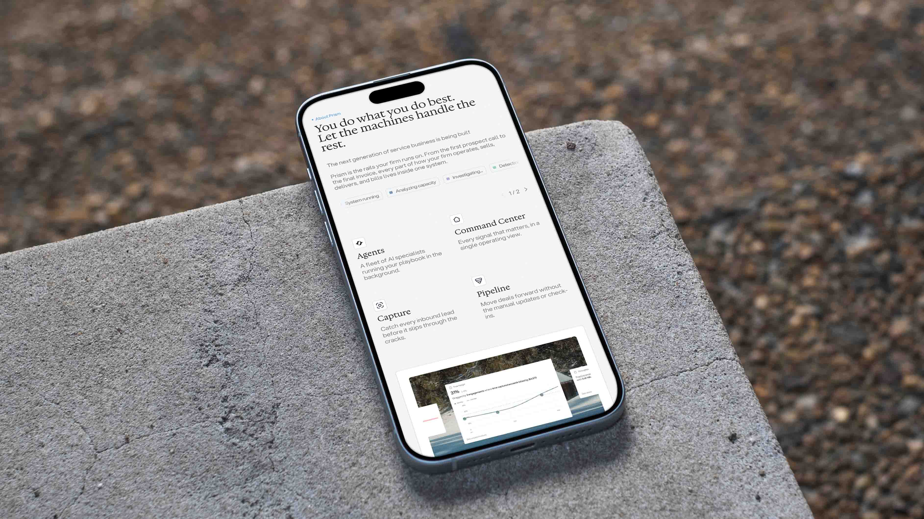
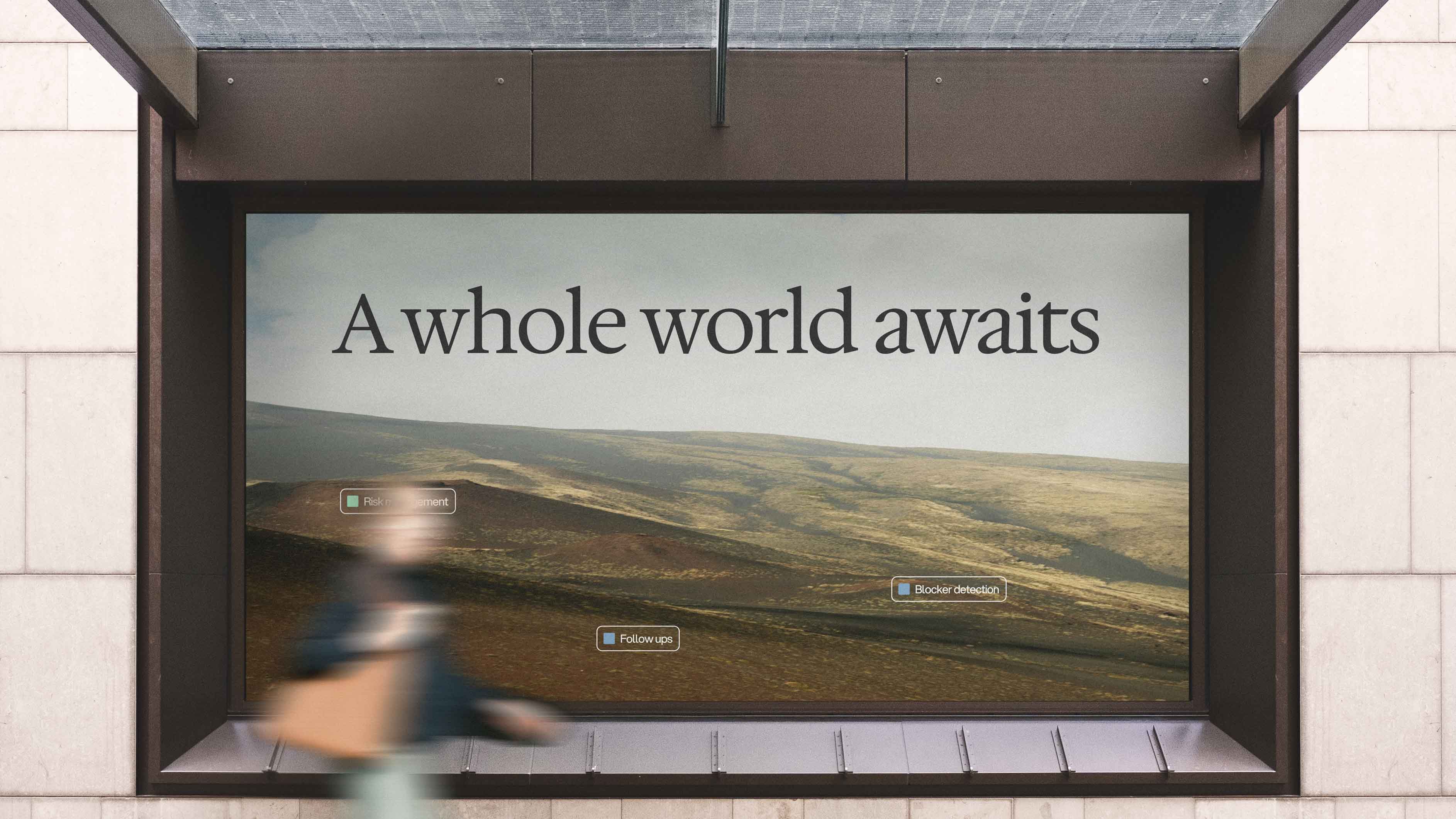
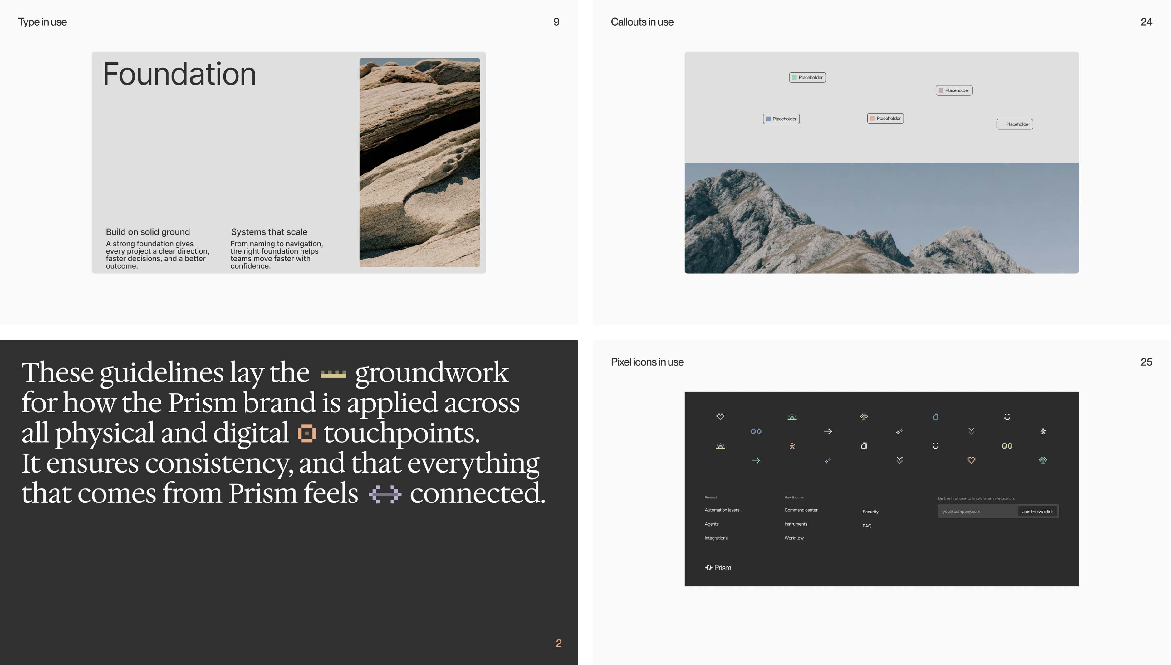
The Prism identity needed to reflect a product that takes the noise of running a firm and turn it into something clear, while staying applicable across a wide range of industries. Open layouts, paired with relaxed colour and direct language keep the brand tied into an effortlessly scalable and consistent brand system. The logo symbolises the inflow, transformation, and outflow of information, wrapped up into a clean, concise package.
Web applications by Lan Hoang.